
(Without Spending $900 or Losing Your Mind Over a Seam)
Here’s how this started: I had people over for dinner last fall and one of them—bless her honest little heart—asked if our dining room was “mid-renovation or just really minimalist.” Ma’am. It was finished. I just hadn’t figured out what to do with the giant beige wall yet.
Which Home Upgrade Does Your Space Really Need?
Answer 5 quick questions to discover the ideas that will work best for your home.
Enter: wallpaper. Because nothing says “I kind of have my life together” like a bold pattern behind your dining table—even if the table itself is from Facebook Marketplace and slightly wobbly.
Anyway, I’ve now been through approximately 47 wallpaper samples, two emotional spirals, and one moment where I considered just Sharpie-ing the walls. These are the 15 ideas that actually looked good (and didn’t make me instantly regret my life choices).
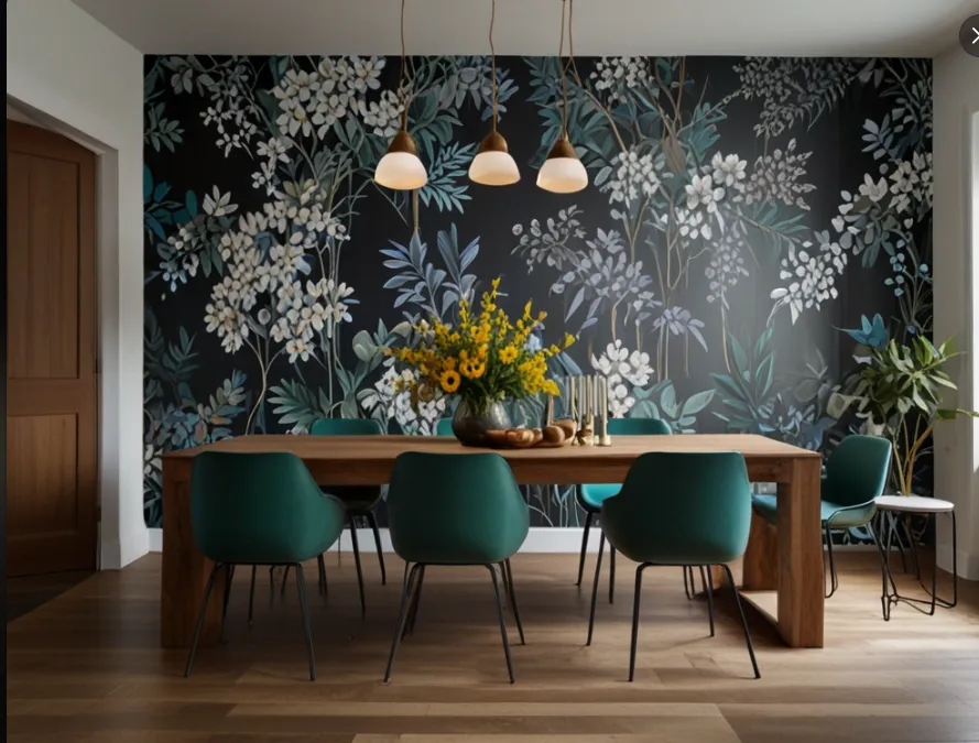
1. Moody Florals = Instant Drama
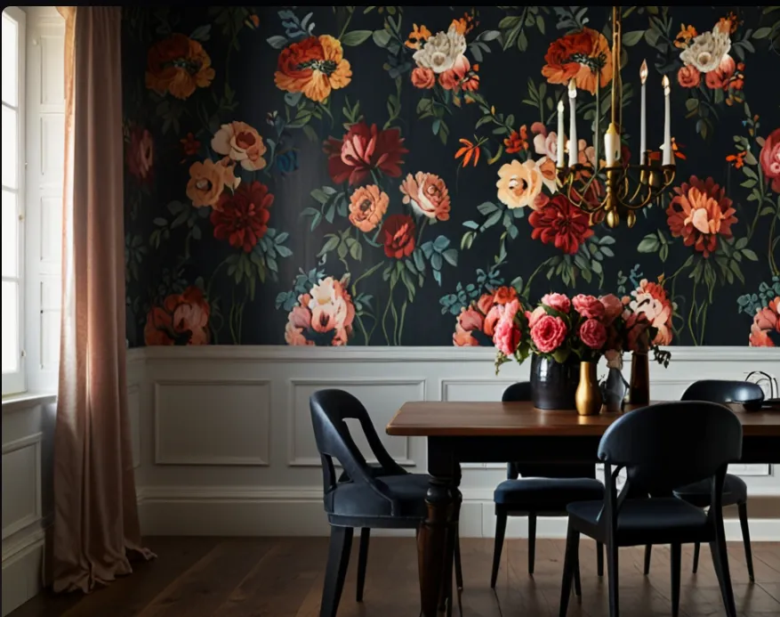
Think big dark flowers, black background, “I drink red wine and know about candlelight.” It’s bold, it’s romantic, and it makes dinner feel fancier—even when you’re serving frozen pizza.
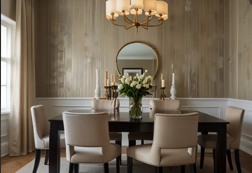
2. Textured Neutrals for the Commitment-Phobes
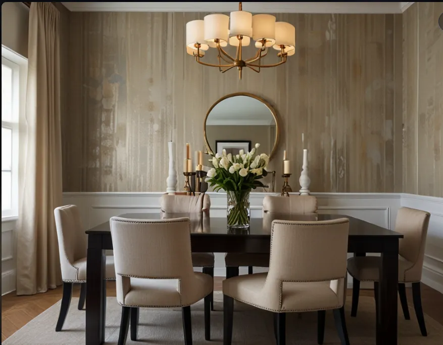
Grasscloth, linen-look, whatever you can’t mess up easily. It adds warmth without demanding attention. Great for people (me) who panic halfway through bold decisions.
3. Bold Geometrics That Say “I’ve Watched HGTV”
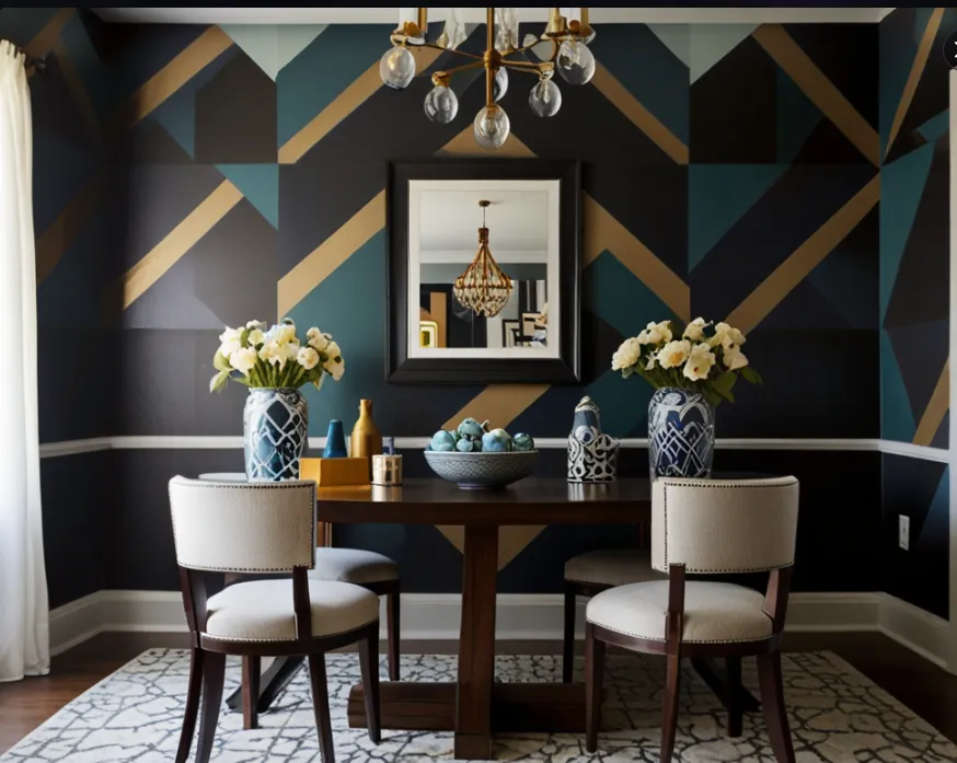
I tried one with gold lines and almost cried with joy. Bonus: it distracts from slightly uneven baseboards.
4. Vintage-Inspired Toile, But Make It Cool
No, not your grandma’s blue bunnies. Look for modern updates—like birds with attitude. I saw one with a squirrel in a hat. I still think about it.
5. Giant Murals (That Look Like You Hired a Designer)
🎯 Discover Your Home Decor Style
Found one on Etsy that made my dining room look like an actual European café. Zero people believed it was peel-and-stick. Including me.
6. Subtle Pattern That Hides Wall Weirdness
I have exactly zero level walls, and this saved me. Small prints, tone-on-tone patterns—they blur imperfections like wallpaper concealer.
7. Gold Accents for a Little ✨Drama✨
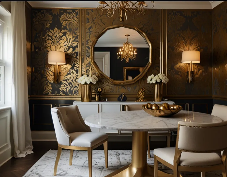
Metallic vines, glints of gold—it reflects candlelight and makes everything look 30% fancier. Even when your napkins are paper towels folded just so.
8. Classic Stripes (But Not Boring)
Vertical = taller ceilings. Horizontal = riskier but cool. Just pick something neutral-ish or you’ll accidentally give your dining room big circus energy.
9. Deep Navy or Forest Green = Chef’s Kiss
Dark colors + wallpaper texture = cozy and intentional. I put a dark green print in mine and suddenly I host more dinners. It’s science.
10. Art Deco Patterns That Feel Like a Jazz Club
Think Gatsby, but affordable. These prints scream, “We own a bar cart and at least one good cocktail shaker.”
11. Whimsical Prints That Start Conversations
Wallpaper with tiny tigers? Yes. Abstract lemons? Sure. Just don’t put it behind the person who gets distracted easily. (Me again.)
12. Black and White = Always a Safe Bet
Graphic, stylish, and weirdly easy to match. Just add wood tones or greenery and it won’t feel sterile. Promise.
13. Ceiling Wallpaper = Instant Designer Energy
Warning: not for the faint of heart or short on neck strength. But holy wow does it look cool when you pull it off.
14. Watercolor Prints = Calm and Pretty
Soft, blurred prints that make your walls feel like an art piece. Ideal if you want something interesting but not aggressive.
15. Temporary Panels (Because Life Is Short)
If you rent, commit issues, or just don’t trust your decision-making, removable panels are your friend. You can even pretend you “designed it that way.” Go ahead, lie a little.
Final Thoughts:
Wallpaper doesn’t have to be terrifying. Start small. Try a sample. Let your cat judge it for 3 days like I did. Worst case? You peel it off and blame it on the lighting.
Just remember: the goal isn’t perfection—it’s distraction. If people are talking about your wallpaper, they’re not asking why you’re out of clean forks again.
Need help picking a print that won’t give you design regret in six months? I’ve made the mistakes, and I’ve got opinions. Drop your vibe in the comments and I’ll play wallpaper matchmaker.
Some content on this website is created with AI assistance and carefully reviewed and edited by the Nekig team to ensure quality and accuracy.
💬 Join Our Small Space Living & Decor Community
Get daily apartment decor ideas, smart storage hacks, and budget-friendly inspiration from thousands of small space lovers.
👉 Join the Facebook Group