
The first time I painted a room light blue, I was in my early twenties, living in a slightly crooked apartment with squeaky floors and a landlord who thought “renovation” meant replacing one lightbulb a year. I wanted a bedroom that felt calm — a little escape from the chaos outside (and the upstairs neighbor’s tap-dancing hobby).
So, I grabbed a gallon of paint called “Morning Mist,” rolled it onto the walls, and… magic. Suddenly, my mismatched furniture looked intentional, the room felt twice as big, and I could breathe easier.
Years later, after dozens of paint swatches, Pinterest boards, and home experiments, I’ve realized something: light blue is one of those colors that never actually goes out of style. It’s like the white T-shirt of interior design — versatile, classic, and flattering in almost any setting.
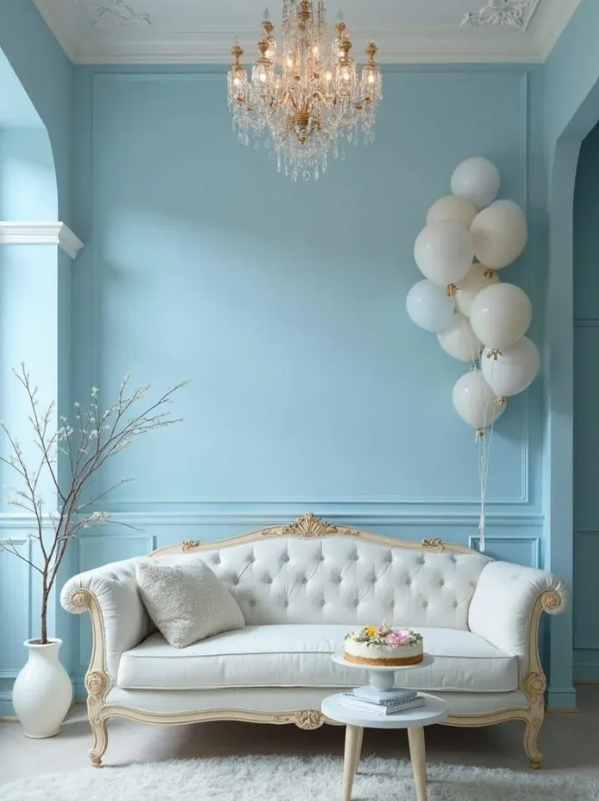
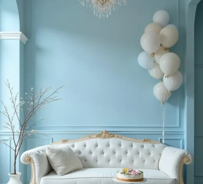
IMAGE BY PINTEREST
Here’s why it works so well, and how you can use it without your home looking like an ice cream shop.
1. It’s the Color Equivalent of a Deep Breath
Light blue has this uncanny ability to slow things down. Walk into a soft blue room, and you immediately feel like you can unclench your jaw and stop checking your email every two minutes.
It’s no wonder it shows up in spa waiting rooms and beach cottages — it’s literally been shown to lower stress levels. I’ve noticed it in my own home too: my light blue living room is where I curl up with tea and a book, and somehow, even the cat naps longer in there.
It Plays Well with Other Colors
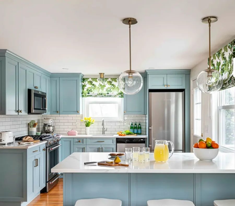
IMAGE BY INSTAGRAM
One of the reasons light blue never gets old? It’s ridiculously easy to pair with other shades.
With white: Clean, crisp, and airy. Think seaside cottage vibes.
With beige or tan: Warm and soft, like sand and sky.
With dark wood: A little more traditional and cozy.
With navy: Adds depth and sophistication.
In my dining room, I combined pale blue walls with warm oak chairs and woven placemats, and now it feels like a forever-summer dinner party spot.
Works in Every Room (Seriously)
I’ve tried light blue in almost every space:
Bedrooms: Calm, cool, and the perfect backdrop for crisp white bedding.
Bathrooms: Instantly spa-like, especially with fluffy white towels.
Kitchens: Fresh and bright — pair with white cabinets for a classic look.
Living rooms: Relaxed but still elegant, especially with layered textures.
Even my tiny laundry nook (yes, a nook — it’s basically a closet with a washer) got a light blue facelift, and now folding towels feels slightly less like a chore.
You Can Shift the Mood by Changing the Undertone
Not all light blues are created equal. Some lean warm, some cool, some almost gray.
🎯 Discover Your Home Decor Style
Warm light blues (hint of green): Inviting and coastal.
Cool light blues (hint of gray): Modern and calming.
Pure pastel blues: Fresh and cheerful, perfect for kids’ rooms or airy kitchens.
When I was repainting my home office, I went with a soft blue-gray so it would feel calm without making me too sleepy — productivity is still the goal, after all.
It Ages Gracefully
Light blue doesn’t scream for attention. It’s timeless because it quietly works in the background, letting furniture and decor take the spotlight.
I’ve had the same light blue walls in my guest room for almost eight years (unheard of for me), and they still look fresh. Changing out the throw pillows, bedding, and art is enough to make the space feel brand new without touching the paint.
It Plays Well with Different Styles
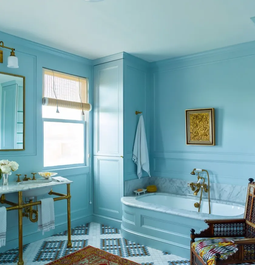
IMAGE BY INSTAGRAM
Whether your home leans modern, traditional, farmhouse, coastal, or somewhere in the “eclectic chaos” zone (hi, that’s me), light blue adapts.
In my friend’s ultra-modern apartment, her light blue accent wall is paired with black metal shelves and minimalist furniture — sleek but still inviting. Meanwhile, my cousin’s vintage farmhouse kitchen wears the same shade with open shelves and copper pans, and it feels completely different.
It Reflects Light Beautifully
Here’s something I learned purely by accident: light blue can make small, dim rooms feel bigger. It reflects light without being as stark as pure white, and it adds just enough color to feel interesting.
In my old rental, the hallway was dark and narrow. A coat of pale blue paint made it feel open enough that people actually stopped noticing how close the walls were.
It’s Seasonless
Some colors feel like they belong to a season — burnt orange in fall, mint green in spring. Light blue, though? It works all year:
Spring/Summer: Fresh and breezy with white or pastel accents.
Fall/Winter: Cozy it up with deep navy, warm woods, and chunky knits.
I swap out my throw blankets and pillow covers each season, and the blue walls always adapt.
It’s Easy to Accessorize Around
Once your walls are light blue, you can go wild with accessories: gold picture frames for warmth, black lamps for contrast, woven baskets for texture.
My trick is to use nature-inspired decor — seashells in summer, pinecones in winter — so the space always feels connected to the outdoors.
It’s Just… Happy
Maybe this is the least scientific reason, but it’s true: light blue just makes people happy. It’s a color that reminds us of open skies, calm water, and sunny days. Even in the middle of winter, my blue-painted rooms make me feel like the world’s a little brighter.
Quick Tips If You’re Thinking About Painting:
Test swatches in natural and artificial light before committing.
Choose a finish based on the room — eggshell for living spaces, semi-gloss for kitchens/baths.
Pair with plenty of texture so the space doesn’t feel flat.
Don’t forget the ceiling — a pale blue ceiling can make a room feel open and airy.
Final thought: Light blue isn’t just a color. It’s a feeling — one that works quietly in the background to make your home feel more serene, more open, and more like you. Trends will come and go, but light blue will always be there, waiting to turn a regular room into your favorite space.
Now if you’ll excuse me, I have a paint sample board in my kitchen that I’ve been staring at for three days. I think I know which shade’s going up next…