
Small footprint, big impact—this is where one-wall kitchens prove their quiet power.
Done right, a single run of cabinetry can feel sculptural, efficient, and downright glamorous.
If you’re searching for one-wall kitchen ideas that save space and look amazing, consider this your blueprint—expert strategies that blend proportion, storage, and style without skimping on luxury.
Which Home Upgrade Does Your Space Really Need?
Answer 5 quick questions to discover the ideas that will work best for your home.
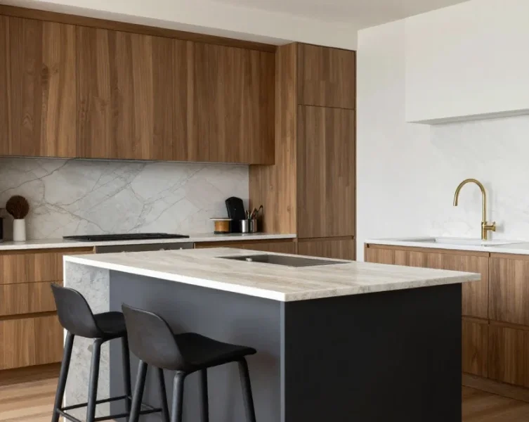
1. Go Full Height for a Seamless, Luxe Envelope
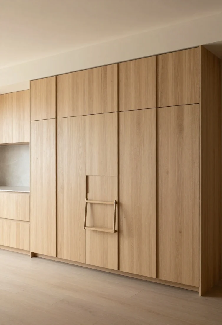
Nothing looks more tailored than cabinetry that reaches the ceiling. Floor-to-ceiling units elongate the room, amplify vertical lines, and clear counter clutter. When everything has a home—appliances, pantry, recycling—you achieve clean sightlines that feel serene rather than sparse.
Why it works: A full-height grid establishes strong architectural rhythm. Tall doors create uninterrupted planes, making a compact wall appear grand. The eye reads fewer breaks, which supports a calm, spacious feel.
How to do it:
- Use push-latch or integrated pulls for a minimal facade.
- Employ one restrained finish—such as matte lacquer, rift oak, or fluted wood—to avoid visual clutter.
- Specify a step-stool niche or slim ladder rail if ceilings are high.
Avoid: Overmixing cabinet door styles. Too many panel profiles interrupt the vertical flow. Consider shopping categories like tall pantry units, integrated appliances, and custom millwork.
2. Choose a Statement Backsplash That Doubles as Art
On a single wall, your backsplash is prime real estate. Treat it like a gallery moment—continuous stone, richly veined porcelain slab, or a hand-made tile installed to the ceiling. The backdrop should anchor the composition while reflecting light and personality.
Why it works: A dramatic vertical plane grounds the kitchen and provides contrast against minimal cabinetry. Scale and movement in the stone or tile introduce depth without overwhelming the footprint.
How to do it:
- Run slab behind the hood and shelving for uninterrupted flow.
- Balance bold patterns with quiet cabinetry in warm neutrals or deep monochromes.
- Add a slim ledge for art, a small vase, or salt cellars to make the surface feel curated.
Avoid: Busy mosaic tile paired with ornate cabinet fronts. The clash can make the wall feel frenetic.
3. Layer Lighting Like a Boutique Bar
With limited footprint, light is your secret luxury. Plan three layers: task (under-cabinet or under-shelf LEDs), ambient (a linear ceiling wash or recessed fixtures), and accent (a sculptural sconce or two to frame the cook zone).
Why it works: Layering adds dimension and flatters surfaces. Good lighting sculpts texture—think ribbed wood, brushed metal, honed stone—so your materials look elevated even in tight quarters.
How to do it:
- LED strips under shelves for shadow-free prep zones.
- Warm 2700K–3000K temperature to enrich wood and brass.
- A standout sconce or petite pendant to punctuate the composition.
Avoid: One overhead fixture doing all the work. It flattens the room and emphasizes shadows against the backsplash. Consider shopping categories like linear lights, under-cabinet lighting, and statement sconces.
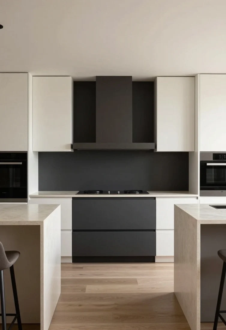
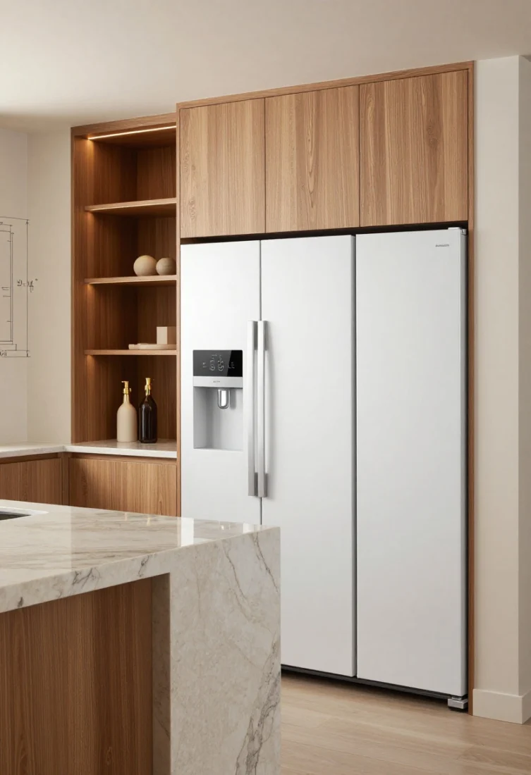
4. Integrate Appliances for a Furniture-Like Facade
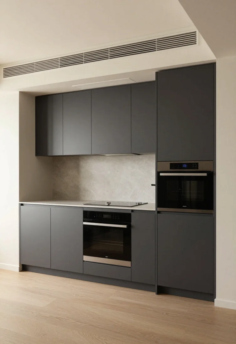
Your one-wall kitchen has no space for visual noise. Panel-ready appliances—fridge, dishwasher, even microwave drawers—create a continuous, furniture-like elevation. When “kitchen” elements disappear, the entire wall feels curated and residential.
Why it works: Fewer finish changes equals calmer composition. The eye travels smoothly, enhancing perceived space.
How to do it:
- Consolidate tall appliances to one end for symmetry and to avoid a choppy run.
- Choose an induction hob with a low-profile vent solution (recirculating hood with charcoal filters or a slender, ceiling-integrated unit).
- Hide small appliances in a lift-up or pocket-door “breakfast cupboard.”
Avoid: Scattered stainless highlights if your cabinetry is muted. Pick one hero finish or hide the steel altogether.
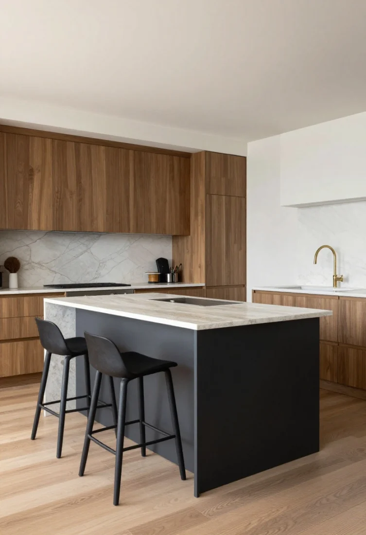
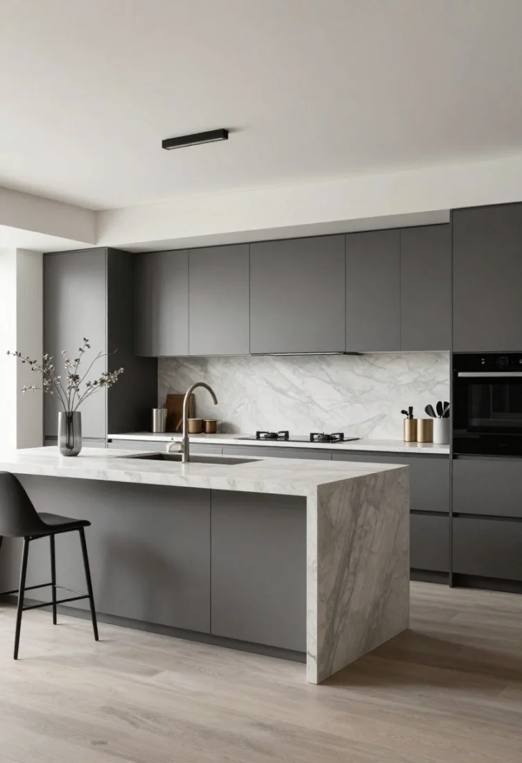
5. Add an Island or Console as a Freestanding Counterpart
🎯 Discover Your Home Decor Style
A one-wall scheme sings when paired with a slim island or narrow console that mirrors the wall’s finishes. It brings prep space and seating without boxing in circulation.
Why it works: Introducing a second axis creates balance and better work triangles. The island softens the linearity, adds proportion, and invites conversation.
How to do it:
- Depth matters: 18–24 inches for a console; 24–30+ inches for a functional island.
- Choose open metal frames or slender legs for visual lightness.
- Repeat a material—stone top echoing the backsplash, or ribbed wood echoing cabinetry—for cohesion.
Avoid: Bulky islands that pinch walkways. Maintain at least 36 inches of clearance; 42 inches is ideal.
6. Use Open Shelving with Intentional Negative Space
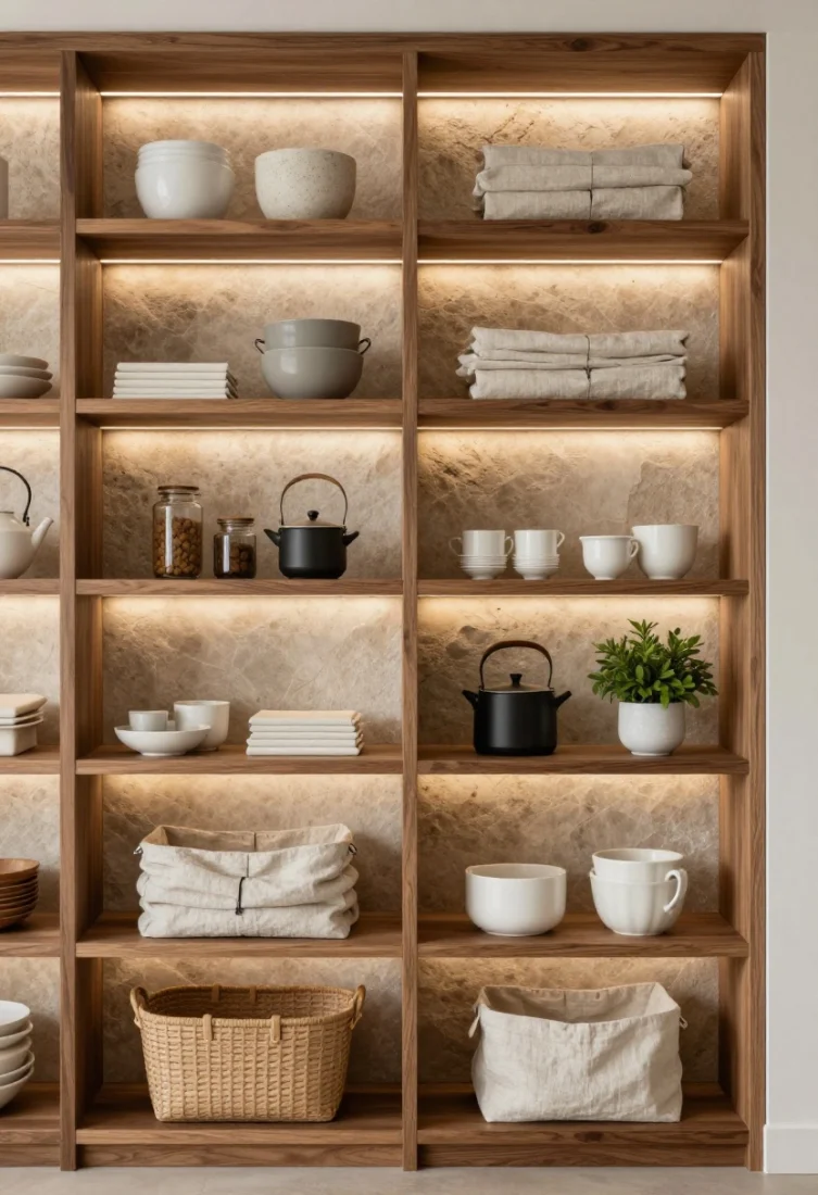
Open shelves can be clutter traps—unless you style them like you would a living room. Curate ceramics, a few cook essentials, and greenery. Leave room to breathe. On a single wall, every gap is as important as what you place there.
Why it works: Negative space is a luxury. It lends gallery appeal and keeps the wall from feeling oppressive. Texture—stone, wood, linen-lined baskets—reads beautifully against a quiet backdrop.
How to do it:
- Use thick shelves in oak, walnut, or powder-coated metal for gravitas.
- Install concealed LED strips beneath for a soft wash over the backsplash.
- Group items by height and material. Vary stacks with vertical objects for rhythm.
Avoid: Overloading with mismatched mugs and packaging. Decant into glass or ceramic canisters and tuck extras into closed storage. Shop categories like open shelving, canisters, and wall decor.
7. Opt for a Monochrome Scheme with Honed Texture
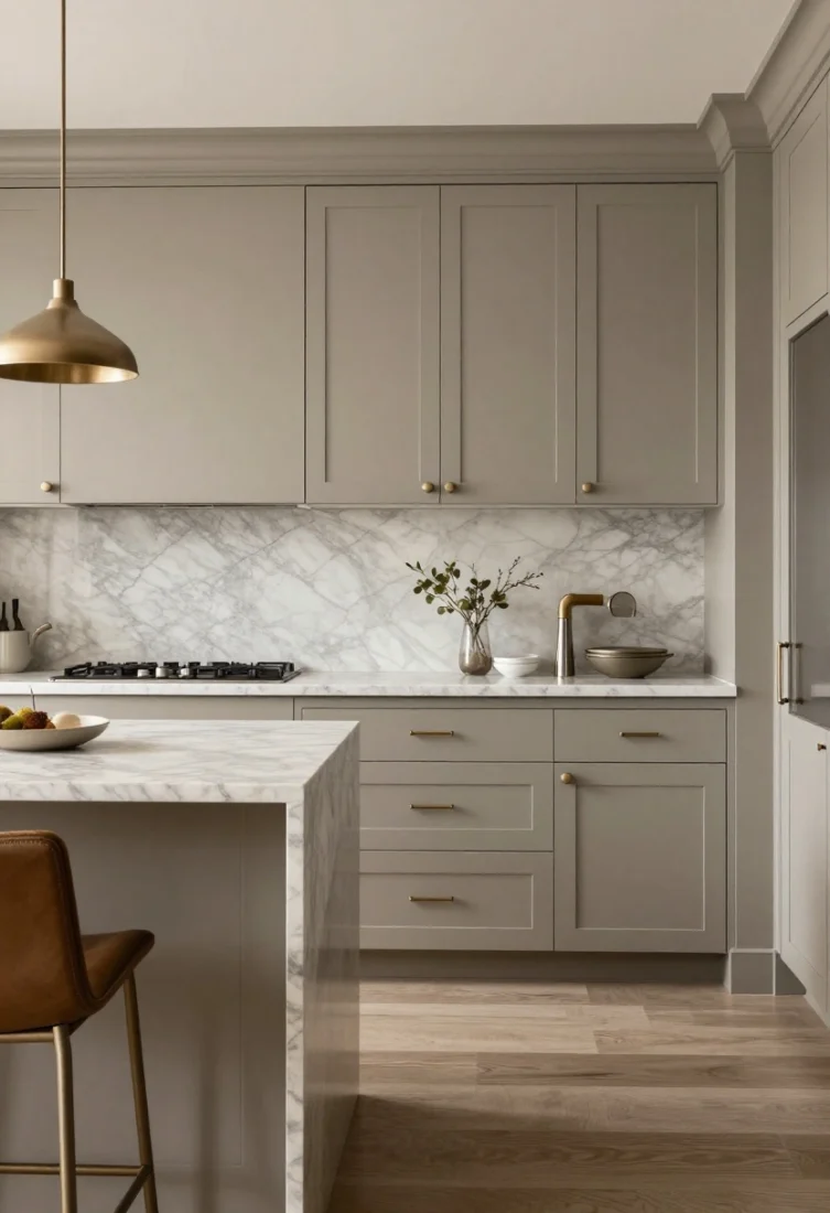
A single palette across cabinetry, counters, and walls is quietly dramatic. The key is depth through finish: matte lacquer with honed marble, brushed nickel, and textural linens. The room reads tonal yet tactile.
Why it works: Monochrome reduces visual interruptions while texture keeps it from feeling flat. The restraint looks intentional and high-end.
How to do it:
- Choose a base hue—chalk white, warm greige, or charcoal—and commit.
- Contrast sheen levels: matte cabinets, satin hardware, slightly reflective backsplash.
- Layer linen runners, a wool rug, or leather stools for softness.
Avoid: Mixing too many metals. One dominant metal with a subtle secondary keeps it polished. Consider shopping categories like rugs, counter stools, and cabinet hardware.
8. Celebrate Hardware as Jewelry
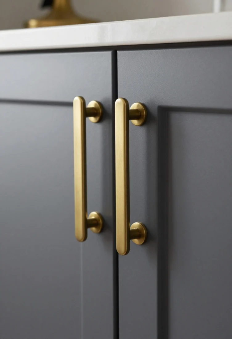
In a one-wall kitchen, hardware becomes the earrings to your evening dress. Scaled pulls or discreet edge pulls can define the aesthetic—think burnished brass, blackened bronze, or knurled stainless.
Why it works: Good hardware adds tactility and contrast. Proportionally larger pulls can elongate doors and feel bespoke.
How to do it:
- Match hardware scale to door height; tall doors deserve elongated pulls.
- Position consistently for a disciplined look—aligned verticals on talls, horizontals on drawers.
- Echo metal finishes in lighting or barstool footrests for cohesion.
Avoid: Tiny knobs on oversized doors—they look timid and strain the design balance.
9. Conceal the Sink or Create a Sculptural One
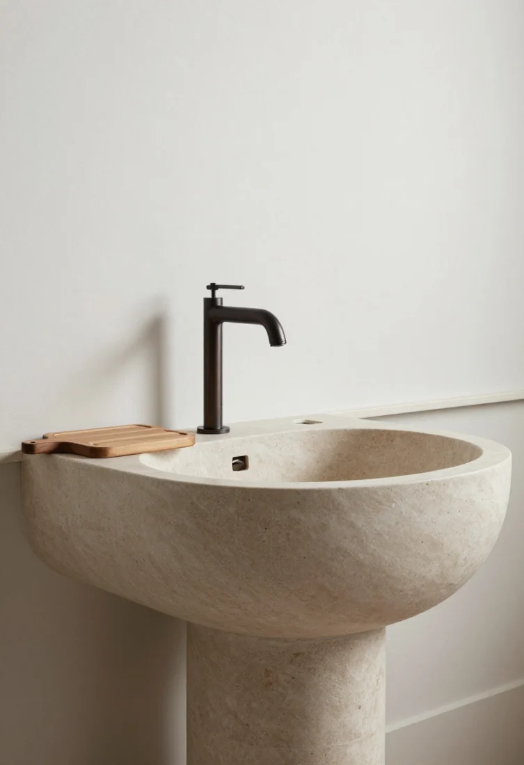
Either hide the sink with a flush, integrated cover for a continuous counter or make it a sculptural moment—a stone apron front, hammered metal, or extra-wide trough.
Why it works: On a single elevation, the sink area is a focal point. Elevating or concealing it preserves the wall’s calm and elevates function into form.
How to do it:
- Specify an undermount with a removable chopping-board cover for prep days.
- Choose a minimalist tap with a pull-out spray; wall-mounted faucets free counter real estate and keep lines clean.
- Flank with recessed soap niches or a slim ledge to avoid bottle clutter.
Avoid: Oversized farmhouse sinks if your wall span is very tight; they dominate the composition unless intentionally balanced.
10. Prioritize Slim Profiles and Negative Reveals
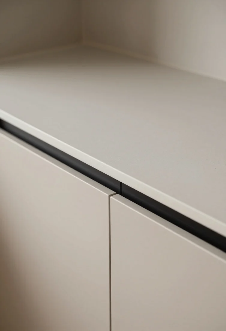
Thin worktops (12–20 mm) and shadowline details make cabinetry feel custom and architectural. A negative reveal under the counter lip or at the toe-kick level lightens the mass and casts an elegant shadow.
Why it works: Fine profiles communicate craftsmanship. Shadowlines break bulk and sharpen edges, making the run appear lighter and more refined.
How to do it:
- Specify slim stone or porcelain for the countertop and matching slab for the backsplash.
- Use recessed toe-kicks or a plinth detail to float the units.
- Keep door gaps consistent—precision is everything in a minimalist scheme.
Avoid: Thick counters plus heavy trim, which add visual weight and crowd a small plan.
11. Use Color Blocking to Define Zones
Even in a small footprint, you can hint at zones with color. Consider a darker center “work core” of drawers beneath the cooktop and lighter talls at the ends. Or flip it: pale core, grounding ends.
Why it works: Color-blocking introduces balance and structure. It directs the eye and helps distinguish prep, cook, and store areas without extra walls.
How to do it:
- Limit to two tones to keep the look elevated.
- Echo the darker tone in the island base or barstools to tie the room together.
- Use a continuous counter to bridge the blocks and maintain flow.
Avoid: Random color placements that ignore appliance locations; the blocks should underline function.
12. Style the Counter Like a Vignette, Not a Workbench
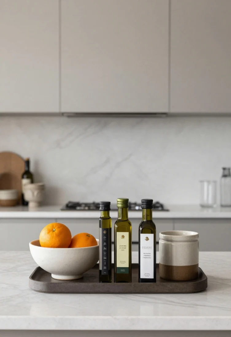
Curate surfaces with the same discipline as a console table. Cohesive canisters, a single sculptural bowl, a petite coffee setup, or a slim tray with oils. Keep everything at or below sightline so the backsplash remains the star.
Why it works: Controlled styling transforms a hardworking zone into a sophisticated backdrop for living. It signals intention—your kitchen becomes part of the main space, not a utility corner.
How to do it:
- Group in odd numbers—three pieces with varying heights and shared materiality.
- Use trays to corral items; it reads tidy and is easy to shift for cleaning.
- Swap seasonal stems or citrus to keep the vignette fresh.
Avoid: Sprawling gadgets. If it doesn’t serve daily joy or daily function, tuck it away. Shop categories like counter accessories, trays, and ceramic serveware.
13. Ground the Composition with the Right Rug and Stools
Textiles and seating finalize the visual story. A low-pile runner softens acoustics and adds a line of color or pattern parallel to the cabinetry. Upholstered or leather-clad stools at the island add warmth and encourage lingering.
Why it works: In a linear plan, soft layers balance the hardscape. A runner draws the eye along the length, enhancing scale, while stools contribute shape and texture.
How to do it:
- Pick a performance rug or indoor-outdoor weave for easy maintenance.
- Echo wood tones or metal finishes from the kitchen in stool frames.
- Mind proportion: slim, backless stools for tight walkways; sculptural, low-back stools if there’s space.
Avoid: Oversized, high-pile rugs that catch on stool legs and visually crowd the floor. Consider shopping categories like rugs, counter stools, and kitchen textiles.
What to Avoid Across All One-Wall Kitchens
- Too many finishes competing for attention—pick a restrained palette.
- Insufficient task lighting—dark counters and backsplashes need thoughtful illumination.
- Shallow storage planning—account for tray depth, baking sheets, rubbish, and tall bottles early.
- Ignoring acoustics—soft textiles and upholstered seating reduce clatter in open-plan layouts.
Smart Shopping Cues
- Cabinetry: custom or semi-custom lines with full-height options and integrated handles.
- Surfaces: honed stone or porcelain slabs for backsplash and counters.
- Lighting: under-cabinet LED strips, a linear ceiling wash, and one statement sconce or pendant.
- Hardware: elongated pulls in brass, bronze, or blackened steel.
- Seating and Textiles: slim-profile counter stools; performance runners and tea towels.
- Storage: tall pantry units, pull-out organizers, breakfast cupboards with pocket doors.
Styling Notes for a Polished Finish
- Keep the top third of the wall visually light—open shelves, slender lighting, or unbroken stone.
- Use symmetry where possible: balanced end panels, centered range, aligned hardware.
- Introduce a living element—herbs, an olive tree in a floor pot, or seasonal branches in a tall vase.
- Consider sightlines from adjacent spaces; your one-wall kitchen should read beautifully from the sofa.
Conclusion
A one-wall kitchen is not a compromise—it’s a canvas for clarity. With full-height storage, integrated appliances, refined lighting, and considered styling, the space becomes an elegant, efficient backdrop to daily life. Embrace restraint, elevate materials, and let thoughtful details—hardware, negative space, layered light—do the heavy lifting. The result is a kitchen that saves space and looks incredible from every angle.
FAQ
What’s the ideal length for a one-wall kitchen?
Aim for 10–14 feet to comfortably fit a sink, cooktop, prep zone, and tall storage. Shorter runs can work with integrated appliances and a nearby island for extra surface area.
Can I fit a full-size refrigerator in a one-wall layout?
Yes—opt for a counter-depth, panel-ready model and group it with tall pantry storage at one end to keep the elevation calm and balanced.
How do I keep a one-wall kitchen from feeling utilitarian?
Focus on texture and lighting: honed stone, fluted wood, warm metals, and layered LEDs. Style the counters like a living space, and add a runner and sculptural stools for softness and warmth.
Recommended Products
Disclosure: As an Amazon Associate, this site may earn from qualifying purchases.
These affiliate-ready categories are broad, safe shopping prompts readers can use to build the look without fake pricing or made-up reviews.
- Full-height storage — Maximizes vertical space and hides clutter for a calm look
- Statement backsplash — Creates a seamless artful backdrop on a single wall
- Task lighting — Brightens prep zones and layers light in compact kitchens
- Integrated appliances — Unifies finishes for a furniture-like, quiet elevation
- Narrow island — Adds prep space and seating without crowding walkways
Shop the Look on Amazon: Give readers a fast path from inspiration to action.
Find Your Style
Answer each question to unlock a quick designer tip for your space.
1. Which change makes a living room feel elevated the fastest?
2. What usually makes this style feel more expensive?
3. If you want guests to stay longer, what should you improve first?
Love this style? Get fresh decor ideas every week
Subscribe for weekly home decor trends, room ideas, and curated product inspiration.
What’s new in home decor
Give readers a reason to come back tomorrow: fresh room ideas, new styling trends, and practical product inspiration.
- 12 Cozy Small Bedroom Ideas That Feel Like a Dream Room
- 12 Dreamy Canopy Bed Ideas for the Ultimate Aesthetic Bedroom Glow-up
- 15 Foyer Table Decor Ideas That Make a Great First Impression
- Cozy Lighting Ideas for Living Rooms (warm & Relaxing Vibes) You’ll Want Tonight
Return daily: refresh your feed, browse new decor ideas, and keep building your next room upgrade step by step.
Some content on this website is created with AI assistance and carefully reviewed and edited by the Nekig team to ensure quality and accuracy.
💬 Join Our Small Space Living & Decor Community
Get daily apartment decor ideas, smart storage hacks, and budget-friendly inspiration from thousands of small space lovers.
👉 Join the Facebook Group
What would you try first?
Invite readers to comment with their favorite idea, their room challenge, or the one update they want to copy from 13 One-wall Kitchen Ideas That Save Space and Look Amazing.
Tell us in the comments: Which tip fits your home best right now, and what room should we cover next?